

Reality check. This year has got away from me. Much like normal ‘new year’s resolutions’, the hype for a new project often diminishes throughout the year. In defence of myself, I’ve had a lot going on, but once again, it’s time to refocus.
Rather than the Codecademy route, I’ve decided to take another approach to this long-term machine learning quest. Mathematics and statistics seems to be a HUGE part of what it takes to succeed in this industry, so I thought I’d start there.
The past few months I’ve read the following books:
- Introduction to Statistics
- Algorithms to Live by, Brian Christian [Goodreads]
- Started the Calculus path on Brilliant [Brilliant Calculus]
- Daily Algebra Problems
- CodeWars Daily Challenge [JazW | Codewars]
This year seems to have been a HUGE step forwards in terms of how AI and ML is impacting our lives. The likes of Mid Journey and more recently Chat GPT are set to revolutionise the world and I’ve found some very cool ways to implement these features in my new day-to-day workflow. (Another blog to follow). This is super exciting and was enough to reignite my love of this amazing new tech.
I want to revisit my journey and get back on track. After delving back into mathematics and statistics – albeit very basic at this stage – I have opted for the [Machine Learning Specialization – DeepLearning.AI], by Andrew Ng.
I am 4 weeks in and already enjoying the different approach. It’s quite math-heavy to what I’m used to, but it’s VERY interesting. The best part? – Week 2 had a project to build a Linear Regression model and I thought I’d also try it off-platform to see how I could implement this into my own project / make sure I had the tools setup correctly.
I had some issues setting up my python again, but I’ve documented the quick fix here [Fixing your python install]. Info was spread all over the internet and it’s nice to have it in one place. So let’s get started:
What is supervised machine learning?
Explanation provided by CHAT GPT:
Supervised machine learning is a type of machine learning algorithm that uses labeled data to train a model to make predictions. The model is trained on a set of labeled data, which contains both input features and output labels. The model is then tested on a set of unseen data to see how accurately it can predict the output labels…
The Project
The aim of this project was to create a supervised prediction model to calculate house sale profits in the US, based on population of city. This was so you could input the population of your city and receive an /idea/ of what you could sell your house for. Sounds simple enough…
Python isn’t completely new to me, so I was able to follow, write and understand a lot of the code. We import datasets, run some analysis on the ’.shape’ of the data, then use matplotlib to visualise it. The steps I followed are documented below:
IDE: Visual Studio Code
Step 1. First I import the necessary libraries; numpy, matplotlib, math and copy.
Step 2. Next, I built out a dataset. The course provided some dummy data for use in the Jupyter notebook, but I recreated the dataset using a numpy array. Let’s say we have two variables (x1 and x2) – you can set it up the following way:
x1 = np.array([1, 2, 3, 4, 5])
x2 = np.array([1, 2, 3, 4, 5])
Step 3. After this, it’s time to create the linear regression model and fit it to our data.
This is where things got fun as I had to calculate both of these variables and translate them to code. The following image shows a nice summary of the formula needed (It’ll no doubt take some time to fully understand what is going on here…but hey it’s an ongoing process and I’m just at the start!):
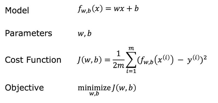
Essentially, I will summarise Linear Regression like this:
Linear Regression = fitting a straight line to your data
The goal of linear regression is to use the cost function to find the value of w AND b that minimizes J
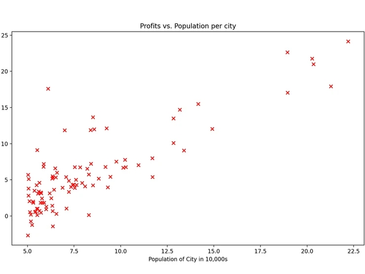
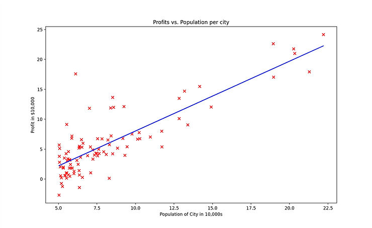
Step 4. Plotting the original data and then the regression model to a scatter graph:
This part was super cool! I’ve done some basic work with matplotlib in the past, but using it as part of a real project makes it 10x more fun. You can see immediately how running this type of analysis on a larger dataset would be incredibly useful.
Something fun I learnt was adjusting how the points are plotted using the ‘marker’ and ‘c’ attributes. In this case it represents a RED ‘X’.
# Create a scatter plot of the data.
plt.scatter(x_train, y_train, marker=‘x’, c=‘r’)
Step 5. Once the model has been fit to the data, we can then use it to make predictions.
This is a very basic model and one that relies on only a limited number of variables. Often, there are many more factors to consider such as sq. foot, amenities in the area, number of bathrooms etc. For this a different model will be needed.
This isn’t my best blog, but I wanted to get something out and ‘on paper’. Recreating this assignment off-platform was actually SUPER useful for me and a great exercise to better understand the process. I had to setup my local python environment AND I went through the code again line by line.
No doubt i’ll have to revisit this module at some point but for now we move onto classification models and logistic regression!
T3B